


Choosing paint colours for a Manchester home starts with the light, not the colour card. Our skies are soft and grey for much of the year. That cool light makes most colours look darker and colder than they did in the shop.
This guide covers aspect, undertones, samples and sheen, from an interior painting team that tests colours on real walls across Greater Manchester.
In short
- Never choose from a screen or a small chip: paint a large sample and look at it on the wall.
- Manchester’s grey, cool light pushes most colours darker and cooler than the chart suggests.
- North-facing rooms usually suit warm undertones; south-facing rooms can carry cooler colours.
- Check each colour’s undertone and light reflectance value (LRV) before you commit.
- Look at samples in the morning, afternoon and evening, under your own bulbs.
- The same colour looks different in matt, eggshell and gloss, so sample in the finish you will use.
Why Manchester light changes every colour
Colour is reflected light, so the light in the room decides what you see. Manchester’s light is mostly soft and diffuse, filtered through cloud and damp westerly weather. It is cool, slightly blue-grey, and it flattens contrast.
That light pushes colours cooler and greyer. A cool grey can turn cold, and brilliant white often reads as a flat grey rather than a crisp white. In winter the sun stays low in the south, so north-facing rooms get no direct sun for months.
Housing plays a part too. The back rooms of Victorian terraces in Withington, Levenshulme and Didsbury are often hemmed in by the neighbouring outrigger. Some are dim even at midday. A colour that sang in a bright showroom can look muddy there.
Choosing paint colours by room aspect
The direction a room faces is the most useful thing to know before you start. Stand at the main window, face out and check a compass app on your phone.
| Aspect | Light through the day | What tends to work | Be careful with |
|---|---|---|---|
| North-facing | Cool, even and indirect, with no direct sun in winter | Warm undertones, earthy greens, soft stone shades and deeper colours used boldly | Cool greys and blue-leaning whites, which can look cold and flat |
| South-facing | Bright and warm for most of the day | Most colours, including cool blues, greens and greys | Strong yellows and warm reds, which can feel intense in full sun |
| East-facing | Bright, warmer light in the morning; cooler and flatter after midday | Colours that hold up in both, such as soft greens and warm neutrals | Judging only in the morning, when the room is at its most flattering |
| West-facing | Cooler in the morning; warm, golden light in the evening | Colours that still work in cool morning light | Oranges and warm pinks, which can glow strongly at sunset |
Then think about when you use the room. For instance, a west-facing living room used mostly in the evening can be judged in evening light. A north-facing home office used all day needs a colour that works at 10am in February.
Undertones: the colour behind the colour
Almost every neutral leans somewhere. Greys lean blue, green or warm red-purple, and whites lean yellow, pink, green or blue. Beiges and greiges lean pink, green or yellow.
Undertones are hard to see on their own and obvious side by side. So compare several samples together, against a sheet of plain white paper. Bear in mind that Manchester’s cool light will exaggerate any blue or green lean.
Undertones also have to work with what is staying. Floors, kitchen units, worktops, tiles and sofas all have undertones of their own. A pink-leaning beige beside a green-grey worktop will never look quite right.
This is the stage where a second opinion helps most. It is why we offer colour and finish guidance in Kearsley and across Greater Manchester.
Light reflectance value (LRV) explained
Light reflectance value measures how much visible light a colour reflects. The scale runs from 0 for black to 100 for pure white. Most major paint brands publish an LRV for each colour, usually on the colour’s web page.
A higher LRV bounces more light around a room. However, a pale colour will not rescue a dark north-facing room if its undertone is cool; it can simply look grey. Sometimes a deeper, warmer colour makes a dim room feel deliberate and cosy instead.
LRV also matters for contrast. In commercial and public buildings, a clear LRV difference between walls, floors and doors helps people with sight loss find their way. At home, it is simply a reliable way to compare how light two colours really are.
If the new colour is much lighter or darker than the old one, plan the coats as well. Our guide to how many coats it takes to cover dark walls explains why.
How to sample paint colours properly
Sample pots are the best insurance in decorating, provided they are used well:
- Paint a large board or a sheet of lining paper, at least A3, with two coats.
- Leave a white border, so the old wall colour does not distort what you see.
- Move it around: beside the window, in the darkest corner, next to the skirting and the floor.
- Look at it in the morning, at midday and in the evening, with the lights on and off.
- Live with it for a few days before deciding.
Boards are better than painting straight onto the old wall. Small patches on a coloured wall are skewed by the colour around them. Thick sample patches can also leave ridges that show through the new finish.
Colour also intensifies over a large area. A chip that looks muted can look much stronger across four walls. A big sample is the closest you will get to the finished room.
Warm and cool bulbs
Artificial light changes colour as much as daylight does. Bulbs are rated in kelvin: warm white is around 2700–3000K, cool white around 4000K, and daylight bulbs higher still.
Warm bulbs push colours yellower, softening cool greys and blues. Cool bulbs make warm colours look flat and can turn whites clinical. For accurate colour, look for bulbs with a high colour rendering index (CRI), ideally 90 or above.
Check samples under the bulbs you actually use. If a colour works by day but not at night, changing bulbs is far easier than repainting.
Making colours flow between rooms
In most homes, you see more than one room at a time. In a terrace, the hall, front room and kitchen can all be in view from the front door. The colours in those sightlines need to sit together. A few simple rules help:
- Keep one trim colour, often a single white, on the woodwork throughout the house.
- Use colours with a shared undertone, or tonal steps of the same colour.
- Carry one colour through the hall, stairs and landing, which link every floor.
Wallpaper can do the linking for you. Choose a paper first, then pull paint colours from it for the rooms next door. Matching paint to paper is far easier than the reverse. Our wallpapering service covers everything from a single feature wall to whole rooms.
Period homes and heritage palettes
Period houses reward a little homework. Victorian interiors often used deeper, richer colours than people expect, while Edwardian schemes were generally lighter. Heritage ranges from Farrow & Ball and Little Greene draw on that history.
A period home does not have to be painted in period colours. However, mouldings, cornices and panelled doors look their best when the scheme respects them. The subject comes up regularly in period homes in Altrincham, Bowdon and Hale.
Old lime plaster needs a breathable finish, such as a clay paint from Earthborn, limewash or distemper, rather than vinyl emulsion. Many of the same products appeal to homeowners who want natural and low-VOC paints in Prestwich.
One caution: a colour matched into another brand’s paint is rarely identical, because the base, pigments and sheen all differ. If you have a colour matched, sample the matched paint rather than the original.
How sheen changes a colour
The same colour looks different in each finish. Flat matt looks soft and chalky. Eggshell, satin and gloss reflect more light. Away from the glare they read richer and deeper, and they show more of the surface underneath.
That is why walls and woodwork in the same colour never quite match, and why that can look deliberate. Our comparison of matt, eggshell, satin and gloss finishes covers where each one belongs.
Colour drenching
Colour drenching takes one colour over the walls, woodwork and often the ceiling. A tougher sheen on the woodwork keeps it hard-wearing, and the slight change in finish adds depth.
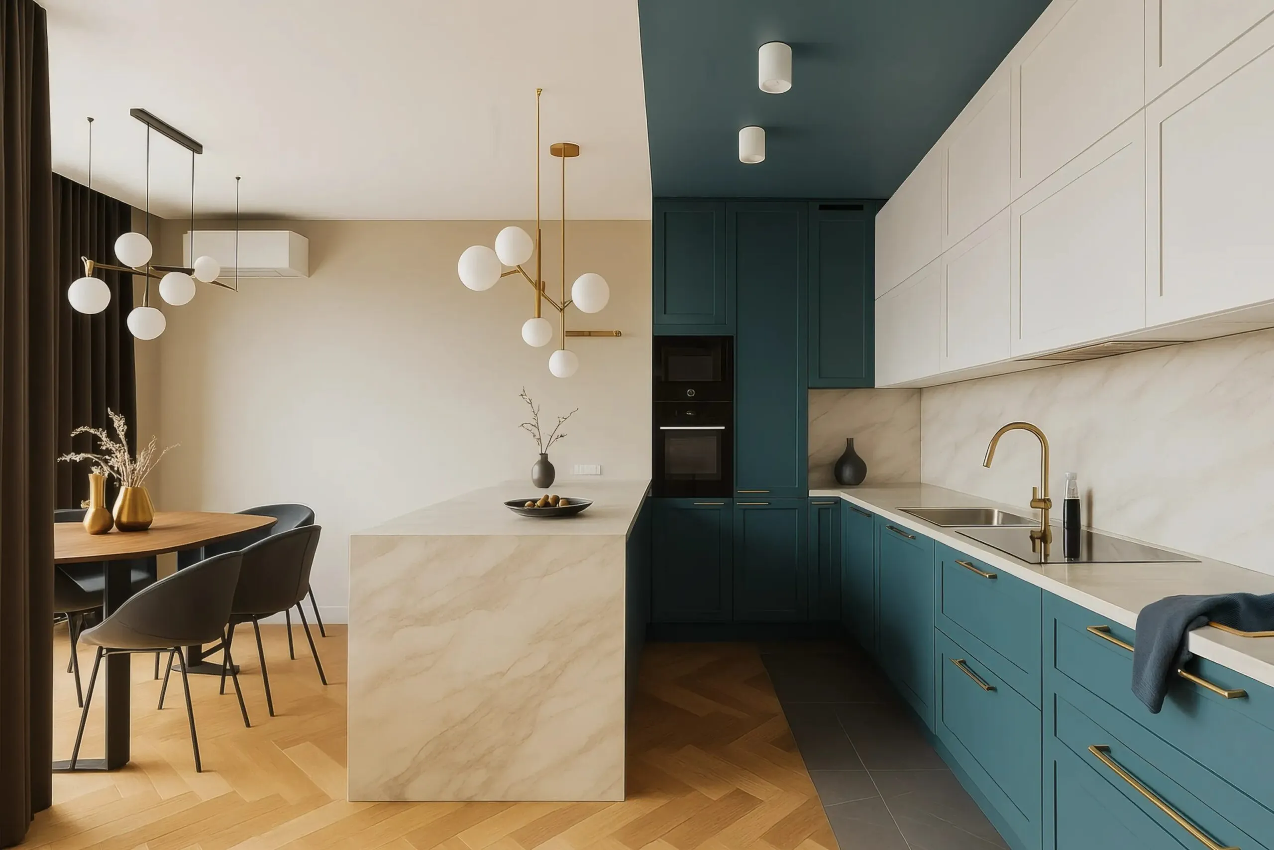
It suits small rooms, hallways and awkward spaces, because it blurs edges and hides odd proportions. It is also unforgiving, since every dent in the skirting shows. Kitchens follow the same logic, with the cabinets often the biggest block of colour in the room. If you are changing the unit colour rather than the units, see our guide to kitchen cabinet spraying in Manchester.
Exterior colours, neighbours and conservation areas
Outside, colours tend to look lighter and brighter in full daylight, so many people choose a shade deeper than they would indoors. Sample on the wall itself, on both the sunny and the shaded elevation. Our exterior painting team can paint up sample areas before you commit.
Look at the whole street too. Brick, stone, roof tiles and the house next door all sit beside your colour. On a semi or a terrace, a new render or door colour affects your neighbour’s view as much as yours. A quick conversation is worth having.
In a conservation area, an Article 4 direction can remove the right to repaint the outside without planning permission. Listed buildings may need consent for changes to colours or paint types. Check with your council’s planning department first; the Planning Portal is a sensible starting point.
Where we draw the line
We will not choose a colour from a screen or a tiny chip. It goes on the wall as a sample first, every time.
Screens vary in brightness and colour balance, so the same shade looks different on every phone. A chip is too small to judge and is usually seen under shop lighting. Neither shows you Manchester light on your own walls.
Choosing paint colours is your decision, and it should be. Our job is to make it an informed one, with large samples and honest advice on undertones and sheen. A few days with sample boards beats repainting a room that looked perfect on a phone.
Get a free quote in Manchester
If your colours are picked, or you would like help narrowing them down, we are fully insured, 5-star rated house painters in Manchester. We will visit, look at the light in each room and give you a free, no-obligation quote.
Arrange your free quote or call 07835 733353.
Frequently asked questions
What colour should I paint a north-facing room?
North-facing rooms get cool, indirect light, so colours with a warm undertone usually work best: warm whites, soft stone shades, earthy greens and deeper warm colours. Cool greys and blue-leaning whites can look cold and flat. Always test a large sample on the wall and look at it on a dull afternoon before deciding.
What is LRV in paint?
LRV stands for light reflectance value. It measures how much visible light a colour reflects, on a scale from 0 for black to 100 for pure white. Higher numbers bounce more light around a room. Most major paint brands publish the LRV for each colour, which helps you compare how light or dark different shades really are.
How big should a paint sample be?
As big as is practical. Paint at least an A3 board or sheet of lining paper with two coats so the colour reads accurately. Move it around the room, from beside the window to the darkest corner, and look at it in the morning, afternoon and evening. A small patch or chip is too little to judge.
Why does paint look different on the wall than on the chart?
The light is different. In Manchester’s grey, cool light, most colours look darker and cooler than on a chart seen in a bright shop, especially in a north-facing room. Colour also intensifies over a large area, and the floor, furniture and bulbs around it all shift how it reads. A large painted sample is the only reliable test.
Should walls and woodwork be the same colour?
They can be. Painting walls, woodwork and often the ceiling in one colour, known as colour drenching, suits small rooms and hallways and makes awkward proportions disappear. A tougher sheen on the woodwork keeps it hard-wearing. A contrasting trim colour is more traditional and suits period rooms with good mouldings and panelled doors.
Do I need permission to change the colour of my house?
Usually not, but check first if you live in a conservation area or a listed building. An Article 4 direction can remove the right to repaint the outside of a house without planning permission, and listed buildings may need consent. Your local council’s planning department can confirm what applies to your street.
